Auster
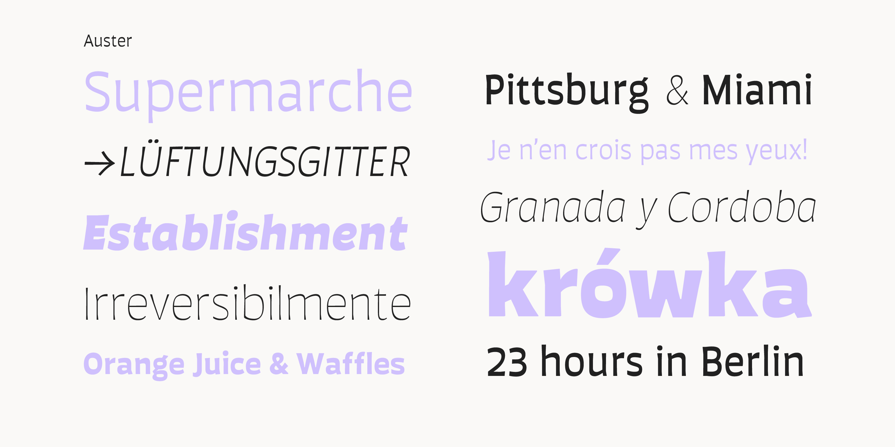
Thin
Thin Italic
ExtraLight Italic
ExtraLight
Light Italic
Light
Book Italic
Book
Italic
Regular
Medium Italic
Medium
SemiBold Italic
SemiBold
Bold Italic
Black
Bold
Black Italic
Heavy
Heavy Italic
A Sans Serif with Flair and reverse contrast
Auster
Designed by Resistenza Type FoundryAuster packs sensational personality in its fine-tuned forms. Confident and quirky, yet comfortable to read, this distinctive san serif family stands out from the crowd. The curves cinch and strokes flair in unconventional places making Auster an unashamed rebel sure to turn heads.
Originally designed during the TipoBrda Workshop in Slovenia. Resistenza spent 3 years developing this 2 style (roman & Italic), 20 weight family. The subtle reverse contrast characters were first painted with a flat brush, then polished in pencil on tracing paper before being carefully digitized, to include language support and all the opentype features you expect in a quality contemporary font.