Why Motion Typography Deserves Special Fonts
Typography plays a central role in motion design—introducing tone, style, and pace before any visuals or voiceover. Whether it's a film trailer, a documentary intro, or a branded video, your choice of font can make or break the impact.
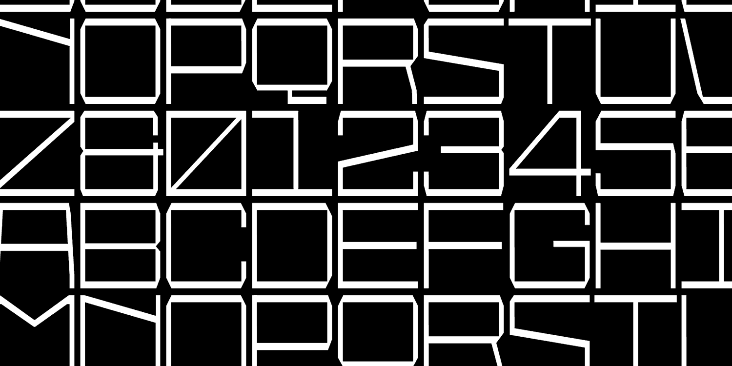
Fonts used in motion need to be more than attractive—they need to perform. Some fonts distort, jitter, or become unreadable when animated. Others are built with smooth spacing, balanced shapes, and variable capabilities that allow seamless movement. These are what we call motion-ready fonts.
What to Look for in a Motion-Ready Typeface
The ideal motion font should have a strong, geometric foundation. Letterforms with clean outlines and stable spacing animate better—especially when scaled, morphed, or layered over fast-moving content.
Equally important is balance. Fonts with optical consistency across styles and sizes will maintain clarity and avoid jitter during transitions.
And then there’s the variable font advantage. Fonts that include adjustable axes (like weight, width, or slant) can create expressive, smooth transitions—all from a single file.
Finally, a good motion font needs to match the tone of your content. A documentary title won’t use the same typeface as a fashion promo or a sports reel. This is where display styles—bold, elegant, retro, or minimal—become essential.
Resistenza Type Fonts Built for Motion
Industria Sans
A modular, geometric sans serif with 36 cuts, featuring sharp angles, ink traps, and soft rounded corners. Designed for large-scale identity projects, Industria Sans offers strong legibility and versatility with its variable font version, allowing seamless weight and width transitions.
In Motion: Dynamically animate the width to stretch a headline or title across the screen, or gradually adjust the weight for emphasis, creating fluid transitions and impactful movements.
Best for: Tech trailers, corporate intros, digital branding, large-scale identity projects.
Squadra
A contemporary sans-serif inspired by Eurostile, Squadra Variable reinterprets geometric elegance with refined versatility. With continuous weight and slant axes, it allows smooth, expressive transitions from Thin to Black and upright to italic.
In Motion: Use continuous transitions from heavy to light weights or dynamically shift from upright to italic to create dramatic movements or emphasize energy in sports or action montages.
Best for: Design, architecture, tech branding, modernist projects.
Pressato
A dynamic and innovative typeface with three axes—weight, width, and slant. Its flexibility allows for personalized designs, whether it's adjusting width for a compressed or expanded look or slanting for added movement.
In Motion: Animate the slant and width axes to create fluid shifts and playful dynamics, or manipulate the weight axis to build intensity and highlight moments in music-driven or high-energy content.
Best for: Art, design, experimental projects, bold and blocky applications.
Furbo
A dynamic monospace inverted contrast variable font with 30 weights and three expressive axes—width, contrast, and turbo. Furbo’s unique axes offer ultimate control for creating both bold and fine typographic expressions.
In Motion: Use the contrast axis to gradually increase or decrease stroke weight, or animate the width and turbo axes to create expressive distortions or bold, tight transitions for a retro-futuristic look.
Best for: Retro designs, fun reels, food branding, energetic projects.
Annuario
A display sans serif with short ascenders and descenders, Annuario’s sharp angles and friendly curves make it a versatile choice for both editorial and dynamic designs. With 48 fonts and a flexible variable font option, it adapts to different applications.
In Motion: Use subtle variations in weight and width for smooth transitions or create dynamic effects by gradually altering the optical size with its variable capabilities to match a cinematic pacing.
Best for: Arts and culture projects, poetry videos, interviews, documentaries.
Superpop
A rounded geometric sans with a brushy script twist. Superpop’s playful mix of geometric and script letterforms creates a fun, energetic vibe. With five weights and outline versions, it offers versatile expressions for lively designs.
In Motion: Animate variable weight shifts or create bouncy, playful transitions using the outline version, or pulse with overshoot animations to bring out Superpop’s dynamic, upbeat energy.
Best for: Events, product branding, social media videos, colorful intro cards, kids’ content.
Performa
A versatile variable font blending geometric structure with grotesque warmth. Performa’s two axes—weight and width—plus an expressive italic companion, allow for seamless transitions between styles, perfect for dynamic and polished motion graphics.
In Motion: Transition smoothly between different weights for emphasis, or animate the width axis to give fluid, responsive movement to titles. Use the italic axis for graceful slants, adding elegance and tension to your animations.
Best for: Fashion trailers, film credits, narrative storytelling, luxury branding.
Tips for Using Fonts in Motion
- Animate with Intention: Don’t animate everything. Choose one movement—weight, opacity, or position—and keep it subtle.
- Use Easing: Avoid robotic motion. Add ease-in, ease-out, or bounce for natural flow.
- Match Typography to Genre: Bold sans for sports, delicate serif for luxury, fun display for playful videos.
- Keep Text Readable: Avoid thin, decorative, or tightly spaced fonts that may blur or jitter in motion.
- Embrace Variable Fonts: Animate transitions without multiple files. Great for After Effects, Premiere, or web.
- Sync Type with Audio: Time animations to soundtrack for polished rhythm and flow.
Create Your Own Custom Motion Font
Need a custom font tailored for animation or title sequences?
We offer:
- Variable font design for dynamic animation
- Handcrafted titles for film and trailers
- Branded typefaces optimized for kinetic motion
- Licensing for web, video, broadcast, and OTT platforms
Final Thoughts
When typography moves, it needs structure, balance, and clarity. Choosing the right motion-ready font can amplify your message, improve readability, and give your content a unique voice.
Whether you're designing titles for a film, animating a trailer, or building a kinetic ad, the right Resistenza Type font—like Industria Sans, Squadra, Pressato, Furbo, Annuario, Superpop, or Performa—will ensure your message flows smoothly and looks professional.