How to use handcrafted typography to create authentic, trustworthy brands
In a world of digital slickness, authenticity sells. Handmade, human-centered brands—whether they’re in food, fashion, beauty, or stationery—stand out by showing the craft behind the product. That’s where typography comes in.
The right typeface doesn’t just display a name—it embodies the personality of the maker. A handmade-feeling font adds depth, charm, warmth, and credibility. It says: “This wasn’t mass-produced—it was made for you.”
Let’s explore what makes a typeface feel handmade, how to use it with intention, and which fonts from Resistenza are perfect for artisan brands.
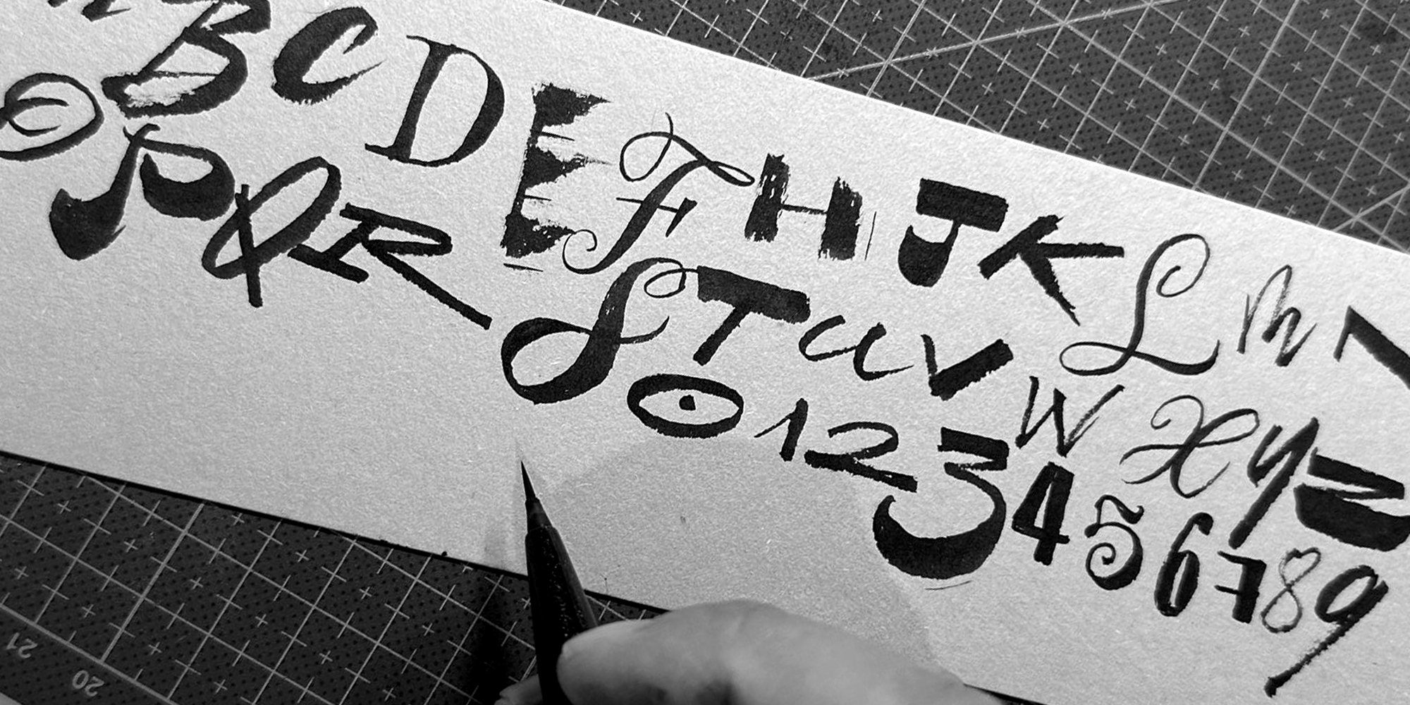
What Makes a Font Feel Handmade?
Handmade fonts are more than just scripts—they’re fonts that tell a tactile story. Unlike default system fonts or overly clean digital typefaces, handmade fonts simulate the emotion and imperfection of human creation. But they don’t need to be messy or distressed—balance is key.
Key Characteristics of Handmade-Feeling Fonts:
- Organic forms: Suggest brush, ink, or pen movement, rather than sterile vectors
- Inconsistent rhythm: Mimics real handwriting—less rigid spacing and height variation
- Textural elements: Evokes physical tools: chalk, marker, woodcut, brush
- Calligraphic influence: Adds dynamic curves and flow, especially in script fonts
- Playful or irregular details: Feels human, warm, approachable—never robotic
Why Handmade Typography Works for Artisan Brands
- They build trust → Audiences associate hand-drawn type with honesty, small-batch care, and human presence.
- They create emotion → They feel personal—like a note or signature—adding emotional value to the brand.
- They stand out → Amid sterile corporate design, they show warmth, approachability, and originality.
- They embody your brand’s soul → Whether joyful, rustic, sweet, or bold, handmade fonts can match your product’s voice.
According to design psychology, even slightly irregular shapes are perceived as more natural and authentic than perfect symmetry.
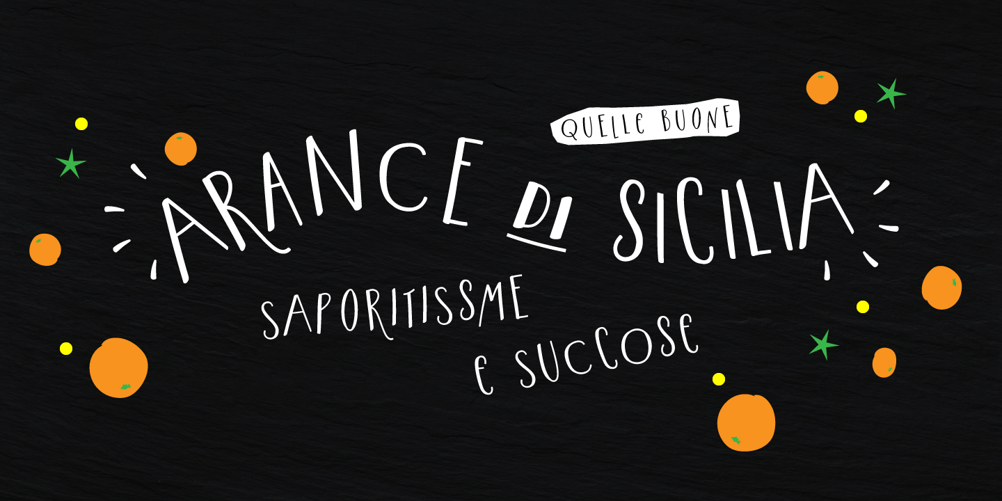
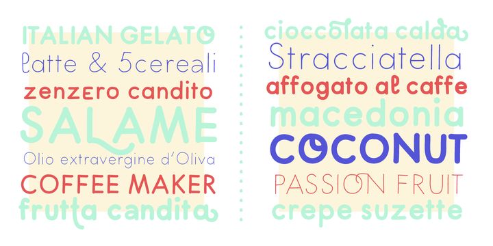
All the following fonts are available at www.rsztype.com, and each offers a unique “handmade” feeling—whether via brush texture, expressive rhythm, or playful structure.
Modern Love
Style: Modern calligraphy script
Vibe: Romantic, handmade elegance
Best for: Boutique beauty, artisan fashion, wedding brands
Why it works: Includes 4 styles—Regular, Grunge, Rough, Caps—and features hand-painted glyphs created with pointed brush and walnut ink. OpenType ornaments, swashes, and alternates enable rich, custom letter shapes. It balances a high-density contrast with natural variability, making it ideal for premium storytelling and large, expressive layouts
Lettera
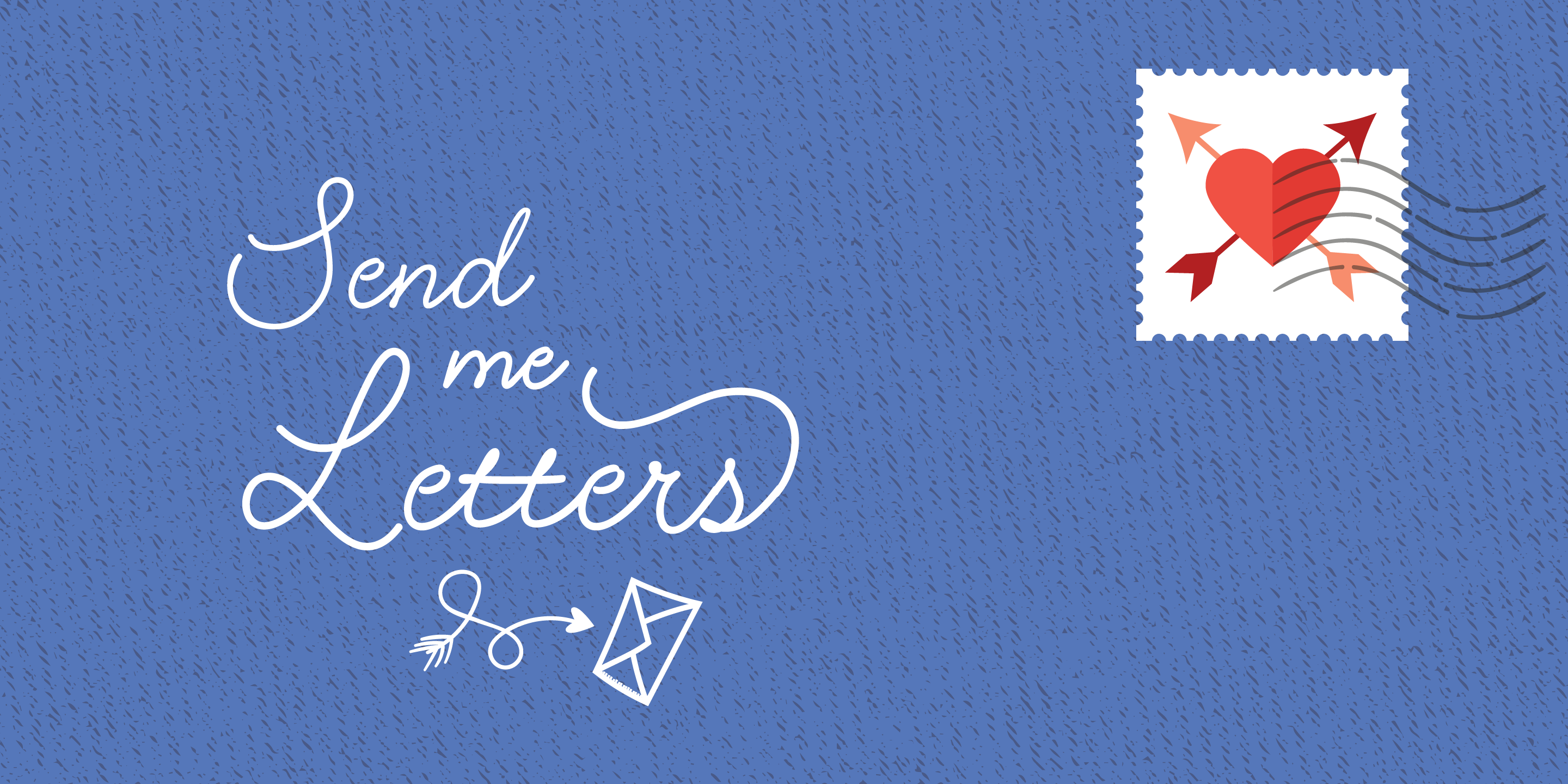
Style: Monoline signature-style script
Vibe: Personal, clean, handwritten
Best for: Stationery, handmade ceramics, product tags
Why it works: Delivers 20th-century penmanship with a rounded nib, featuring 400 glyphs including alternates, swashes, and ending forms. The connected letterforms and casual flow bring an intimate, bespoke touch to logos and wordmarks
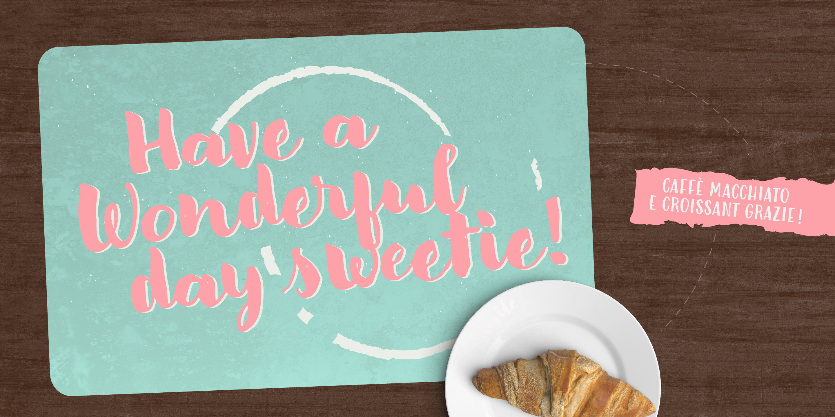
Big Mamma
Style: Bold hand-lettering slab serif
Vibe: Retro, funky, expressive
Best for: Vintage-inspired packaging, cafés, creative boutiques
Why it works: Bold weight and prominent letterforms evoke hand-drawn slab lettering. With its DIY character, it exudes warmth and nostalgia—perfect for products meant to shout "made with love"
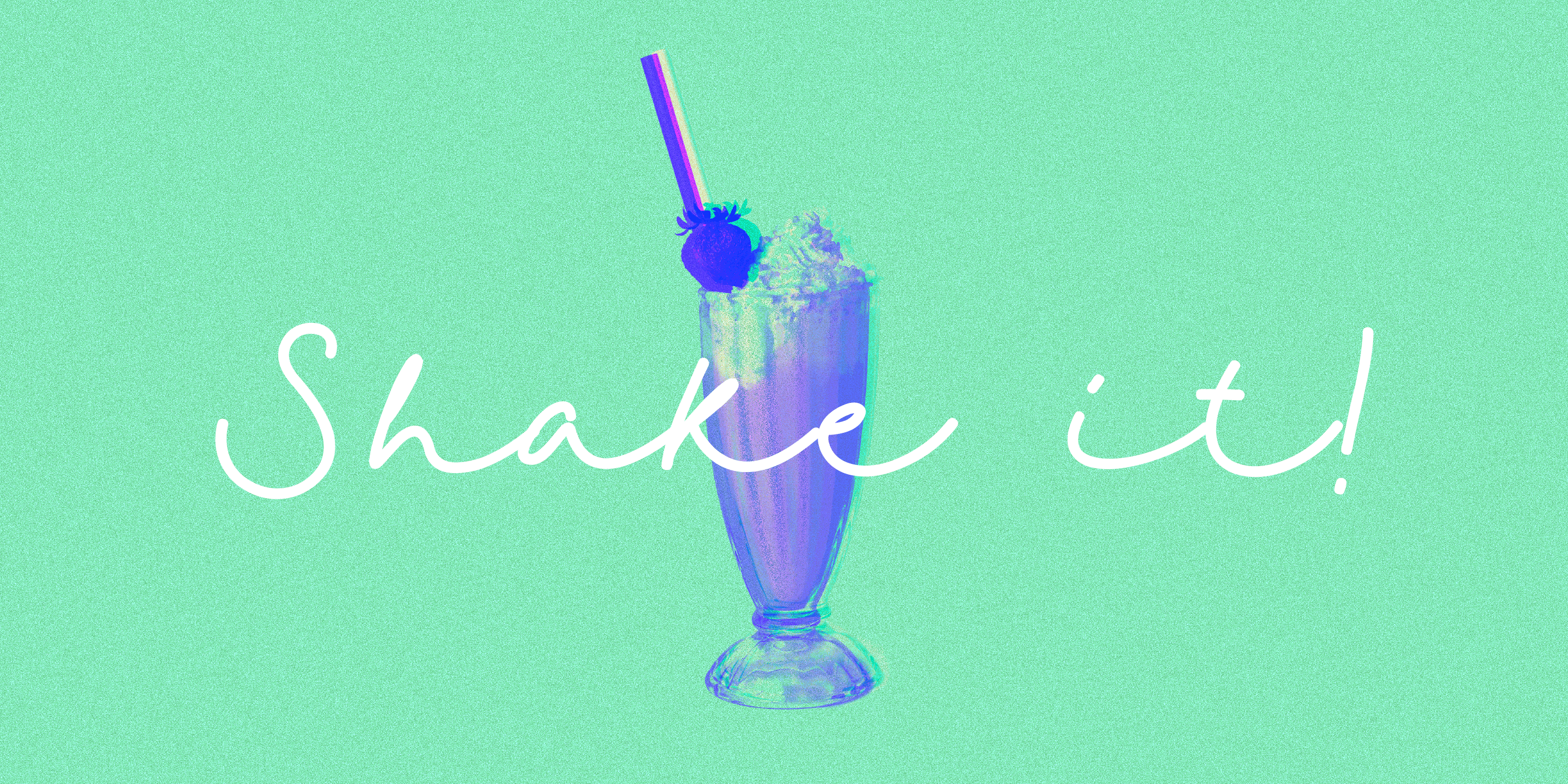
Smoothy
Style: Rounded brush script
Vibe: Cheerful, friendly, organic
Best for: Artisanal soaps, wellness brands, local bakeries
Why it works: As a hand-lettered script with gentle curves and connected strokes, Smoothy creates a trusting and lively feel—ideal for food and lifestyle packaging
Adore You
Style: Light romantic script
Vibe: Gentle, elegant, feminine
Best for: Artisan skincare, florists, handcrafted jewelry
Why it works: A delicate script with thin strokes, graceful flow, and wide spacing—evokes affection and refinement, especially on pastel or foil-accented packaging
Guess What
Style: Playful handwritten script
Vibe: Bouncy, happy, handmade
Best for: Kids’ crafts, natural snacks, artisanal DTC brands
Why it works: A lively script with quirky rhythm and spontaneous strokes that feel authentically handwritten—perfect for energetic taglines and personable branding
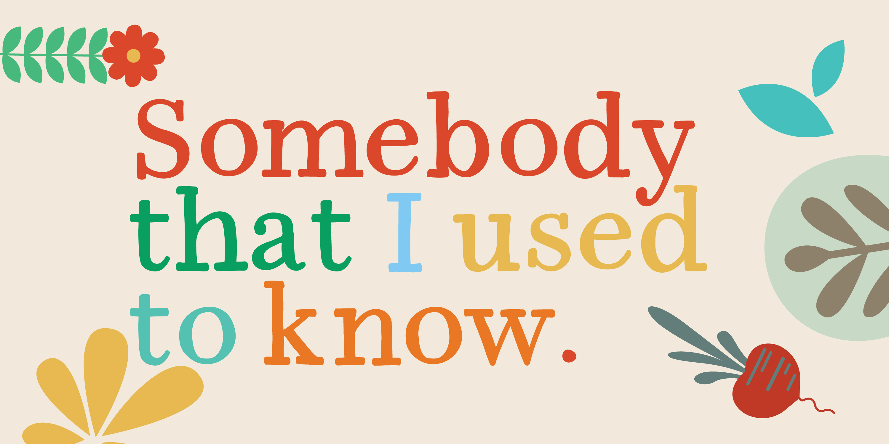
Little Boxes

Style: Quirky display sans serif
Vibe: Playful, geometric, brushy
Best for: Small-batch food labels, greeting cards, unique packaging
Why it works: Box-like shapes with hand-drawn imperfections mimic stencil lettering, adding handcrafted charm to structured layouts
Timberline
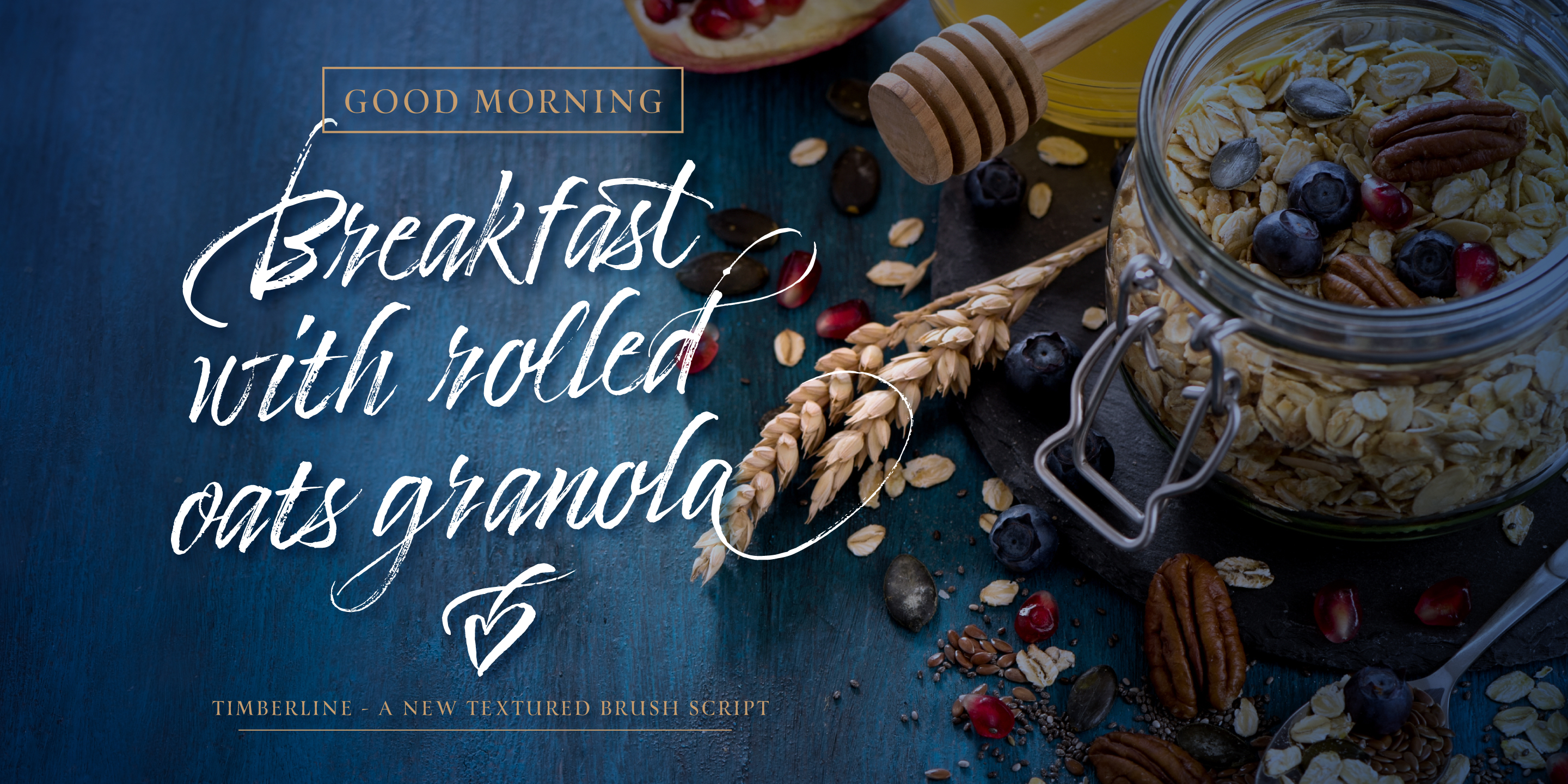
Style: Rustic textured script
Vibe: Gritty, natural, earthy
Best for: Farm products, sustainable goods, craft packaging
Why it works: A textured script that feels carved or brushed, full of wild expressiveness—brilliant for bold headers and eco-brand identities
Hello Fresh
Style: Clean fresh script
Vibe: Bright, natural, approachable
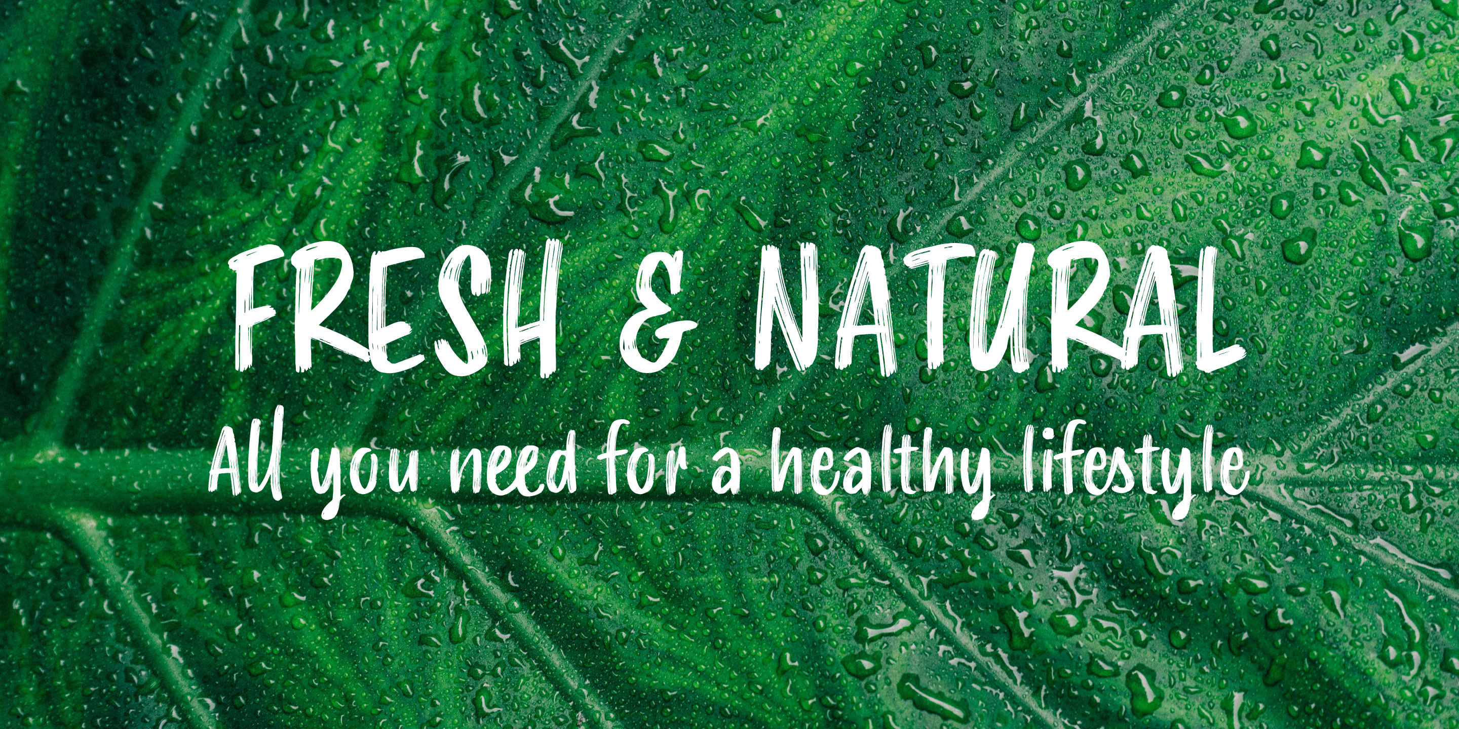
Best for: Organic snacks, farmer’s markets, plant-based products
Why it works: A warm, casual script with friendly curves, giving it a wholesome, handmade feel suited to sustainable packaging
Dolce Caffè Chalk
Style: Chalkboard lettering
Vibe: Cozy, retro, textured
Best for: Cafés, bakeries, vintage-inspired goods
Why it works: Hand-lettered chalk effects bring tactile, analog texture—ideal for kraft and blackboard design contexts
Pesto Fresco
Style: Italic display caps
Vibe: Culinary, rustic, crafted
Best for: Artisan sauces, gourmet packaging, deli signage
Why it works: All-caps display type rooted in food culture, with hand-carved warmth—great for kitchen and market label authenticity
Dolcissimo
Style: Elegant calligraphic script
Vibe: Sweet, luxurious, graceful
Best for: Desserts, luxury gifts, boutique wrap
Why it works: A refined script with strong contrast and open forms—luxurious yet warm, ideal for indulgent pastries and premium packaging
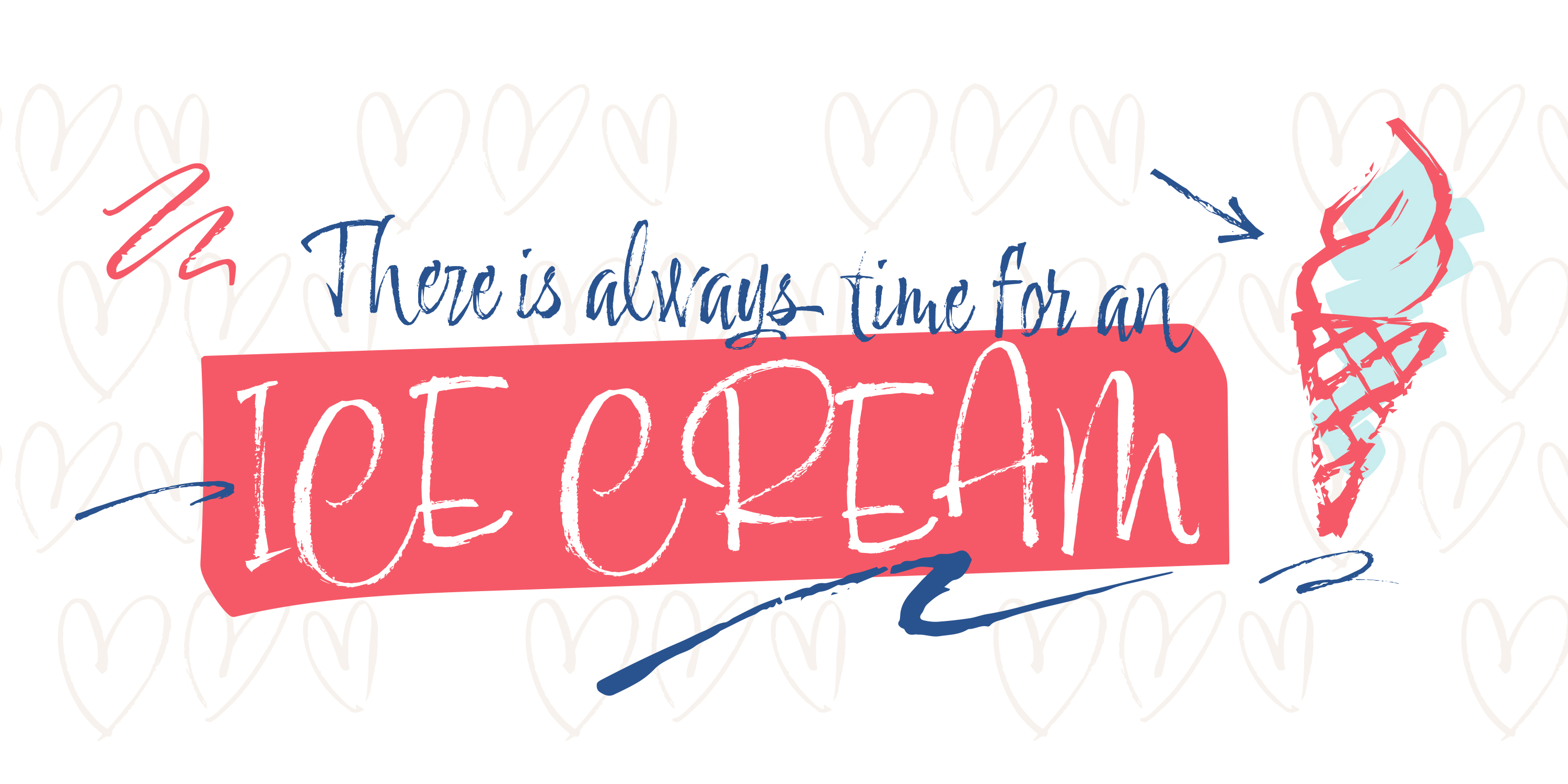
Peperoncino
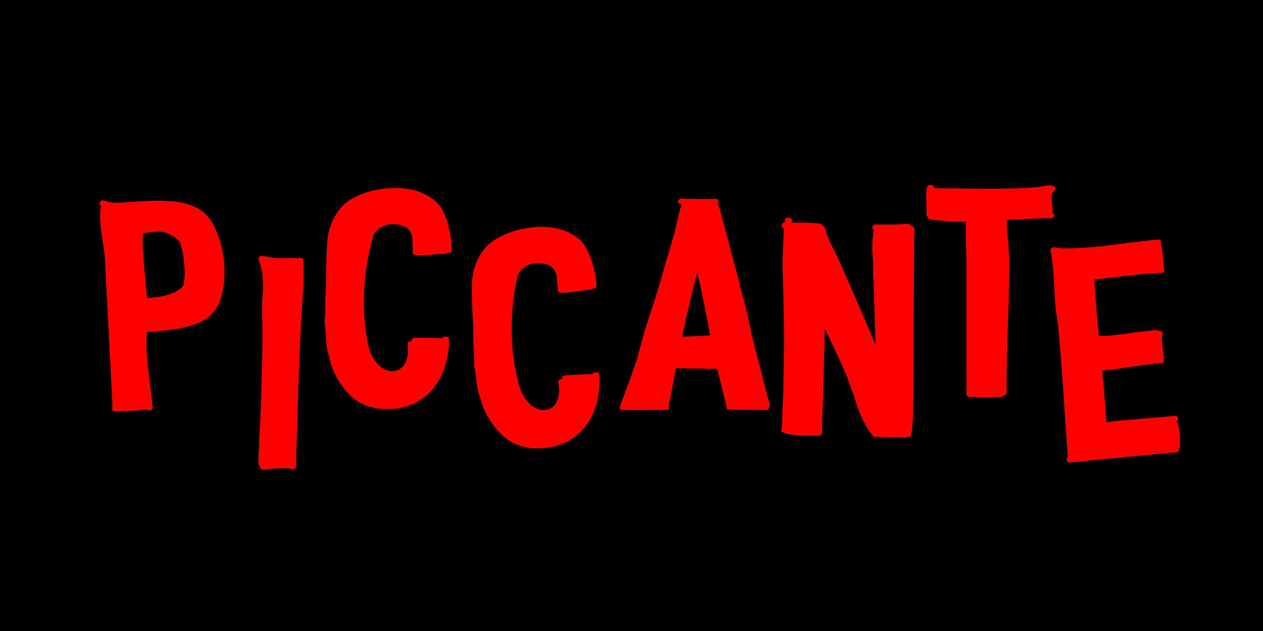
Style: Retro brush script
Vibe: Expressive, bold, Italian
Best for: Pizza boxes, bistros, artisanal grocery
Why it works: Energetic loops and brush strokes evoke vintage Italian signage—perfect for bold handmade food branding
Merendina
Style: Casual handwritten script
Vibe: Sweet, joyful, relaxed
Best for: Cookies, crafts, event branding
Why it works: Bubbly curves and uneven strokes feel genuinely handwritten—ideal for short names and boutique signage
Shabby Chic
Style: Charm script
Vibe: Rustic, romantic, relaxed
Best for: Invitations, labels, boutique greeting cards
Why it works: Based on the monolineal Mina, it uses a dry-brush pen for warm, distressed edges. Long letter connections and alternates create gentle visual rhythm—evoking seaside charm and intimate designs
Natura
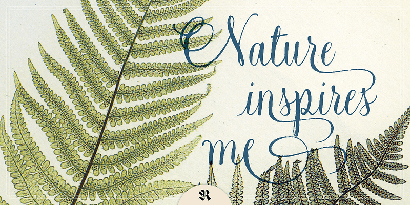
Style: Vintage calligraphic script
Vibe: Nature-inspired, elegant, nostalgic
Best for: Wedding invites, artisanal cosmetics, stationery
Why it works: Though descriptions are limited, the name and category placement suggest an organic, brush-lettered feel ideal for natural, hand-crafted brands
Dream Away
Style: Textured script (6 weights + 2 rough)
Vibe: Graceful, fresh, hand-worn
Best for: Lifestyle branding, artisan packaging, editorial titles
Why it works: Based on Italian “bella scrittura,” it features small apertures and textured strokes with swashes—plus two rough styles—for natural handwriting that feels optimistic and real
Gessetto
Style: Chalkboard font family (script, sans, roman, ornaments)
Vibe: Textured, casual, authentic
Best for: Kitchen signage, café boards, children’s crafts
Why it works: Offers realistic chalk texture across multiple styles and ornaments, built as a flexible toolkit for designers wanting genuine chalk effects
La Bodeguita
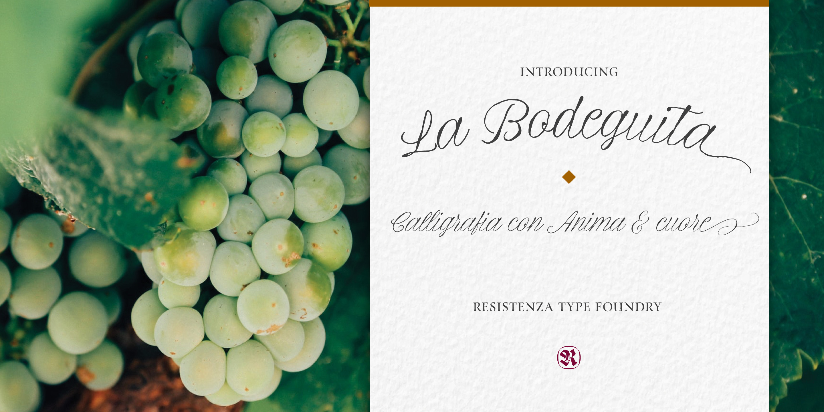
Style: Pointed-nib script (Regular, Slanted, Swashes)
Vibe: Elegant, harmonious, refined
Best for: Wine labels, upscale stationery, boutique branding
Why it works: Crafted with walnut ink and Spencerian technique, it delivers pen-drawn elegance with fluid swashes and 400+ glyphs for rich typographic nuance
Montana

Style: Monoline handwritten family (Clean, Slanted, Rough, Icons)
Vibe: Playful, fresh, sketchy
Best for: Posters, t-shirts, trendy packaging, mobile graphics
Why it works: Blends handwritten warmth with Grotesk discipline. Includes icons and illustrations, low contrast, high legibility, and extra rough styles for tactile expression
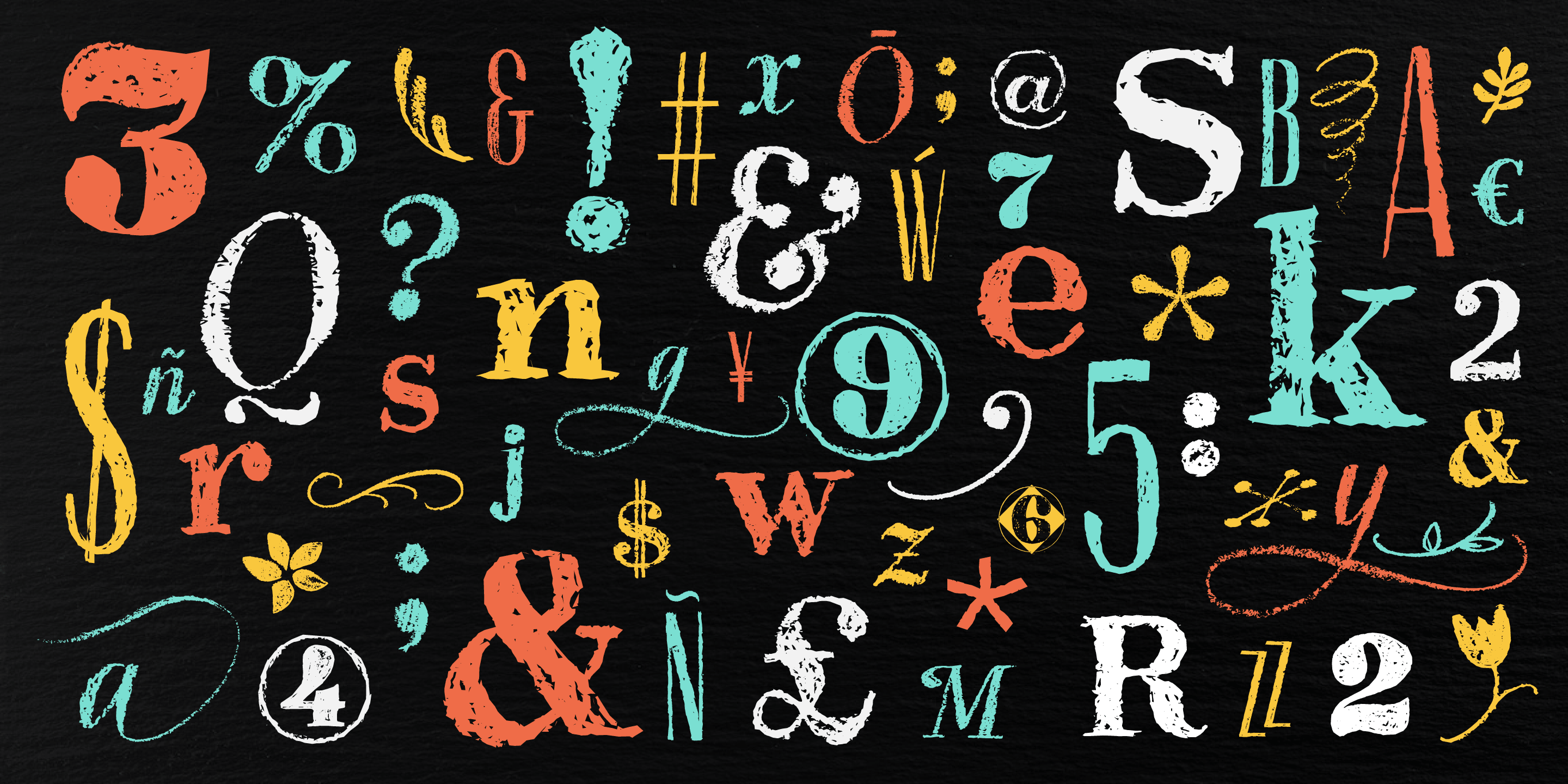
Educational Use Tips for Handmade Fonts
- Use OpenType alternates: Creates variety, avoids repetition, mimics real handwriting
- Pair with structure: Balance expressive scripts with a neutral sans or display font
- Track tightly, lead loosely: Emphasizes visual texture and natural flow
- Use at display size: Many handmade fonts shine when large—don’t shrink the magic
- Don’t overdo it: One expressive font is enough—let it breathe
Craft Is in the Details
A handmade font is never just about style—it’s about tone, emotion, and materiality. These fonts turn branding into storytelling. They make your labels, logos, and websites feel:
- Authentic
- Warm
- Unique
- Trustworthy
And they help the customer feel like they’re buying something created with love.
Each of these fonts was crafted by designers who understand the value of voice in branding.
Want help picking the perfect handmade-feel font for your brand?
Write us: info@resistenza.es