How to Pair Fonts Like a Pro
Pairing fonts is part science, part intuition—but it doesn't have to feel like guesswork. When done right, font combinations bring structure, clarity, and emotional depth to your design. When done wrong, they confuse the user, dilute your brand message, and disrupt readability.
Why Font Pairing Is So Important in Branding
Typography is a core component of visual hierarchy. Pairing fonts properly helps your audience:
- Know where to look first (attention & emphasis)
- Understand what’s most important (structure & hierarchy)
- Feel the brand’s personality (tone & emotion)
Whether you're designing a website, packaging, a pitch deck, or a billboard, font combinations need to do three things:
- Complement each other
- Contrast enough to establish roles
- Align emotionally with your brand
Studies show that well-paired fonts can increase reading speed and user trust—especially in digital environments.
Understanding Font Roles
Let’s clarify how fonts work together before diving into pairings:
- Primary: Conveys brand identity and leads visual tone (e.g., Headlines, logos, callouts)
- Secondary: Supports the primary with calm readability (e.g., Body text, captions, small UI text)
- Accent: Adds flair, attention, or uniqueness (optional; e.g., Pull quotes, CTA buttons, labels)
Most well-structured designs use just 2 fonts—a primary and a secondary. An accent is optional and should be used very sparingly.
6 Bulletproof Font Pairing Guidelines
1. Start With Contrast, Not Conflict
Fonts should look different enough to create hierarchy—but not so different that they fight each other. A serif paired with a sans is the most timeless example.
Good Contrast:
Turquoise +
Performa
Bad Conflict:
Batticuore +
Guess What – Both expressive, neither calm = chaos
2. Match Mood or Tone
Even if fonts are from different categories, they should feel emotionally aligned.
- Minimalist: Squadra + Performa
- Editorial: Gotti + Turquoise Sans
- Friendly: Superpop + Industria Sans
- Tech-forward: Pressato + Performa
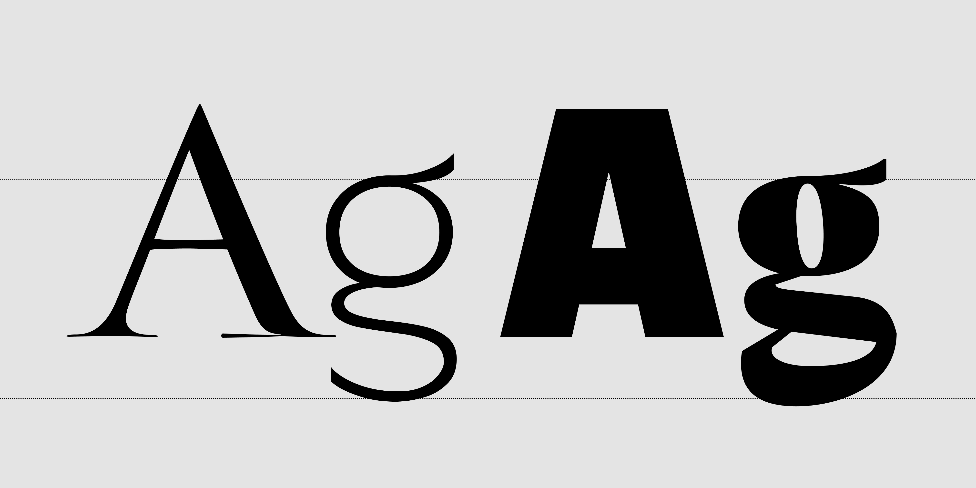
3. Check X-Height & Proportions
Fonts with similar x-heights feel balanced across sizes and devices. When x-heights are too mismatched, the text can feel jumpy or disjointed.
Use tools like FontPairer or Figma plugins (e.g., Font Style Guide) to preview pairings and compare proportions.
4. Try Using a Superfamily
Superfamilies are type systems with multiple styles (serif, sans, mono, etc.) designed to work together.
- Performa — Sans, Mono, and more
- Industria Sans — versatile industrial sans
- Annuario — bold brush sans with alternate styles
These offer built-in harmony and flexibility.
5. Use One Personality, One Neutral
Let your primary font express your voice. Let the secondary font stay calm and legible.
Example: Furbo Bold (expressive) + Performa (neutral, clean)
6. Stick to a 2-Font System
Unless you have a very good reason (like editorial layouts or UI systems), keep your system tight. Great brands like Spotify, Dropbox, or Figma build entire identities using just one or two fonts, consistently.
Insights From Visual Analytics & Research
- Google Fonts Experiment: Users trusted brands more when fonts had clear contrast between headline and body, and used a serif/sans pairing rather than two decorative fonts.
- Eye-tracking studies show: Font weight hierarchy leads scanning behavior. Visual overload reduces comprehension.
- User behavior data: Inconsistent font systems can increase bounce rate by up to 30%. Consistent pairings improve memory recall and content retention.
Real Brand Pairing Examples (Inspired by Style)
- Dropbox: Squadra + Pressato – Modern, editorial
- Duolingo: Superpop + Industria Sans – Friendly, efficient
- Medium: Gotti + Turquoise Sans – Literary, crisp
- Mailchimp: Modern Love + Performa – Quirky meets functional
Pair Less, Pair Better
Great font pairing isn’t about showing off. It’s about structure, emotion, and clarity.
Choose one expressive font that embodies your brand voice. Then choose one neutral, reliable partner that supports the story. That’s it.
Consistency + contrast = strong branding.
Need a ready-to-use font duo or a custom pairing designed for your brand?
Explore our Resistenza Font Library, or contact us for a tailored type system with expressive tone and functional clarity.