Kid-Friendly Fonts Guide
Designing for children isn’t just about using bright colors and cheerful graphics—it’s about creating a visual world that feels safe, imaginative, and accessible. Typography plays a central role in shaping that world. The right typeface can make a toy feel more magical, a snack more delicious, or a workbook more approachable.
Whether you’re working on packaging, branding, editorial design, or tags, choosing a typeface for kids’ products means striking a balance between playfulness and clarity, creativity and readability. And while your audience includes children, the design also needs to resonate with parents and caregivers who make the purchasing decisions.
Here’s what to look for in a child-friendly typeface—plus some Resistenza Type favorites that bring personality, warmth, and function to any kids’ brand.
1. Choose Friendly, Rounded Letterforms
Soft, rounded shapes help fonts feel safe and welcoming—ideal for toddlers, preschoolers, and even early readers. Rounded terminals, generous bowls, and open forms give a sense of friendliness and trust.
Smoothy, Superpop, and Hello Fresh strike that perfect tone. Smoothy offers hand-drawn script energy with soft brush curves. Superpop is a bold, round sans with fun proportions and retro charm—perfect for packaging or display. Hello Fresh brings a bouncy, handwritten flavor that’s lighthearted and accessible.
These fonts are perfect for branding snacks, storybooks, or any product looking to spark a joyful first impression.
2. Prioritize Clarity and Readability
Kids (especially early readers) and parents need to process information quickly. Fonts for children’s products must remain legible at small sizes, have strong character distinction, and be easy to scan.
Gessetto and Beach Please are excellent for this. Gessetto replicates the charm of chalk lettering while maintaining open counters and smooth rhythm. Beach Please is clean and casual, with enough structure to remain readable even in compact formats.
Use them for product names, age ranges, instructions, or even headlines on packaging.
3. Add Character with Quirky Alternates
Children are drawn to irregularity and surprise—and so are their eyes. Fonts that include quirky alternates or an unexpected rhythm can add just the right touch of playfulness.
Little Boxes and Flipante are perfect examples. Little Boxes has a handmade feel, with spontaneous letterforms and slight variations that create visual interest. Flipante’s wide/narrow variable axis lets you tweak the mood while keeping things playful and unexpected.
These fonts work beautifully for toy packaging, children’s books, and logos that aim to stand out from the crowd.
4. Use Texture and Imperfection
Not everything for kids needs to be polished. In fact, fonts that feel hand-drawn or textured can bring a sense of craft, creativity, and fun—especially in products related to art, DIY, or food.
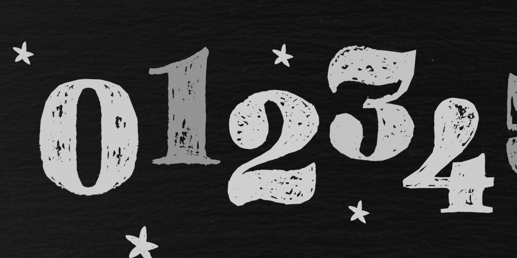
Gessetto and Dolce Caffè Chalk deliver exactly that. Gessetto’s chalk texture brings a classroom or craft vibe, while Dolce Caffè Chalk’s rough brushstrokes add emotional warmth and informality. Both fonts suggest spontaneity, making them ideal for packaging crayons, snacks, kits, or handmade goods.
Texture also makes a font feel more “real” in mockups or lifestyle photography—a useful edge for social media or e-commerce.
5. Balance Structure and Warmth
Not every brand for kids has to be bubbly and exaggerated. Educational publishers, clothing lines, and minimalist packaging often benefit from more structured fonts—while still needing a friendly voice.
Auster Slab and Quaderno are two versatile choices. Auster Slab is solid and legible, offering a confident slab serif style that still feels human. Quaderno, a clean script with gentle curves, adds elegance and personality without losing clarity.
Use them for learning materials, sustainable kids’ fashion, or high-end children’s packaging.
Design Tips for Kids' Typography
- Pair expressive fonts with neutral ones: Let playful fonts shine in logos or headlines, but balance them with simple fonts for instructions or details.
- Test at small sizes: Make sure your chosen fonts remain legible on small labels, tags, or digital buttons.
- Avoid sharp or overly abstract forms: These may feel cold or uninviting for younger audiences.
- Check language support: If your product is sold internationally, multilingual or accented character support is a must.
Creating With Heart and Purpose
Designing for children invites a unique kind of creativity—where type isn’t just a tool, but a voice. The fonts you choose shape how kids (and their parents) perceive your product: whether it’s fun, safe, inspiring, or smart.
At Resistenza Type, we create fonts with personality—designed to bring out the best in storytelling, packaging, and branding. Our collection includes a variety of options suited for young audiences, from playful scripts to bold sans serifs and textured display fonts.
