Brand Typography Through History
Fonts are not just styles—they’re timestamps. Every typeface carries the cultural, technological, and emotional baggage of the era it came from. When used intentionally, that history becomes a tool for brand storytelling.
From imperial Rome to the flexible type of the digital age, typography has shaped the way people perceive institutions, products, and messages. This post isn’t just a trip through typographic history—it’s a guide to how you, as a designer or brand, can use that history to create deeper connections and more memorable visual identities.
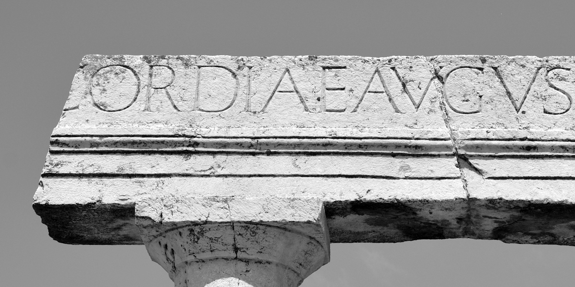
Roman Inscriptions: The Original Brand Voice
Typeform: Capitalis Monumentalis
Era: 1st century BCE
Symbolism: Power, permanence, sacred authority
Carved in stone on monuments like Trajan’s Column, these early letterforms were proportioned, balanced, and timeless. They weren’t functional—they were ceremonial. They commanded respect.
Modern Brand Use: Time Magazine, The Vatican, Hollywood epics
Use it if: Your brand wants to signal tradition, high value, or eternal relevance.
Avoid it if: You’re aiming for approachability or tech-forward accessibility.
The Renaissance & Humanist Type: Typography as Enlightenment
Typeform: Garamond, Jenson, Bembo
Era: 15th–16th century
Symbolism: Rational beauty, humanistic values, knowledge
With the invention of the printing press, typography evolved into a medium of mass knowledge. Humanist serif typefaces were readable, elegant, and grounded in classical calligraphy.
Modern Brand Use: Penguin Books, The New Yorker, Einaudi Publishers
Use it if: You want to communicate elegance, education, or legacy.
Avoid it if: You need ultra-modern, mobile-first clarity.
Transitional & Didone Serifs: The Drama of Contrast
Typeform: Baskerville, Didot, Bodoni
Era: 17th–18th century
Symbolism: Enlightenment, sophistication, fashion
Elegant but assertive. These are typefaces that perform with thick verticals, thin horizontals, and refined shapes.
Modern Brand Use: Vogue, Harper’s Bazaar, Tiffany & Co., The Met Opera
Use it if: You want upscale, theatrical, or classically beautiful tone.
Avoid it if: Your tone is friendly, grounded, or minimalist.
Industrial Revolution: Loud, Useful, Working-Class
Typeform: Clarendon, Rockwell, Egyptian
Era: 1800s
Symbolism: Strength, utility, commercial mass
Slab serifs were built to grab attention—blocky, bold, and utilitarian.
Modern Brand Use: Levi’s, Caterpillar, Harley-Davidson
Use it if: Your brand is bold, utilitarian, or nostalgic.
Avoid it if: You’re aiming for elegance or refinement.
Modernism & Geometric Sans: Form Follows Function
Typeform: Futura, Helvetica, Univers
Era: 1920s–50s
Symbolism: Order, objectivity, minimalism
Modernists believed design should serve clarity and structure. Typography became about communication, not decoration.
Modern Brand Use: Apple, NASA, MUJI
Use it if: You want to feel global, efficient, or progressive.
Avoid it if: You need to show warmth, heritage, or playfulness.
Digital Age & Postmodern Fonts: Rule-Breakers Welcome
Typeform: Emigre, grunge fonts, pixel type
Era: 1980s–2000s
Symbolism: Rebellion, DIY, individuality
With desktop publishing came creative explosion. Designers embraced distortion and texture.
Modern Brand Use: Thrasher Magazine, youth fashion, zines
Use it if: You want to challenge norms or reach youth markets.
Avoid it if: Your audience expects polish and clarity.
Web Fonts & Systematization: UX Meets Design
Typeform: Roboto, Open Sans, Inter
Era: 2000s–2015
Symbolism: Accessibility, digital clarity
Performance and legibility became top priorities across screen sizes.
Modern Brand Use: Google, Stripe, Spotify
Use it if: You design for digital-first experiences and scalable UI.
Avoid it if: You’re aiming for traditional or tactile craftsmanship.
Variable Fonts: The Typographic Future
Typeform: Inter Variable, Recursive, ABC Dinamo
Era: 2016–Present
Symbolism: Responsiveness, personalization, range
One file, infinite flexibility—customizable for weight, width, slant, and more.
Modern Brand Use: Duolingo, Adobe, Pentagram clients
Use it if: You want scalability, performance, or adaptive identity systems.
Avoid it if: You're designing for constrained print-only formats.
What This Means for Branding Today
Fonts are cultural signals. When you choose a typeface, you're aligning your brand with a timeline, a philosophy, and emotional references.
- For timelessness → Use Roman or Renaissance serif structures
- For modernity → Use neutral sans-serifs or geometric types
- For disruption → Use expressive postmodern or custom display fonts
- For adaptability → Use variable fonts or responsive typographic systems
Smart branding isn’t about being trendy—it’s about being intentionally timeless or strategically futuristic.
Typography Is Living History
Typography evolves with us. It reflects the politics of its time, the tools we use, and the ways we communicate. Today, when you choose a typeface for your brand, you’re joining a lineage of expression. Make that connection meaningful.
Want to find a typeface that aligns with your brand’s values and historical tone? Explore the Resistenza Type Foundry catalog—or contact us to develop a custom type system rooted in your brand's story and era.
