The Art and Logic of Font Pairing
Knowing how to pair fonts is one of the most useful skills in typography — but it doesn't have to feel like guesswork. When done right, a font combination brings structure, clarity, and emotional depth to a design. When done wrong, it confuses the eye, dilutes the brand message, and undermines readability before a single word is read.
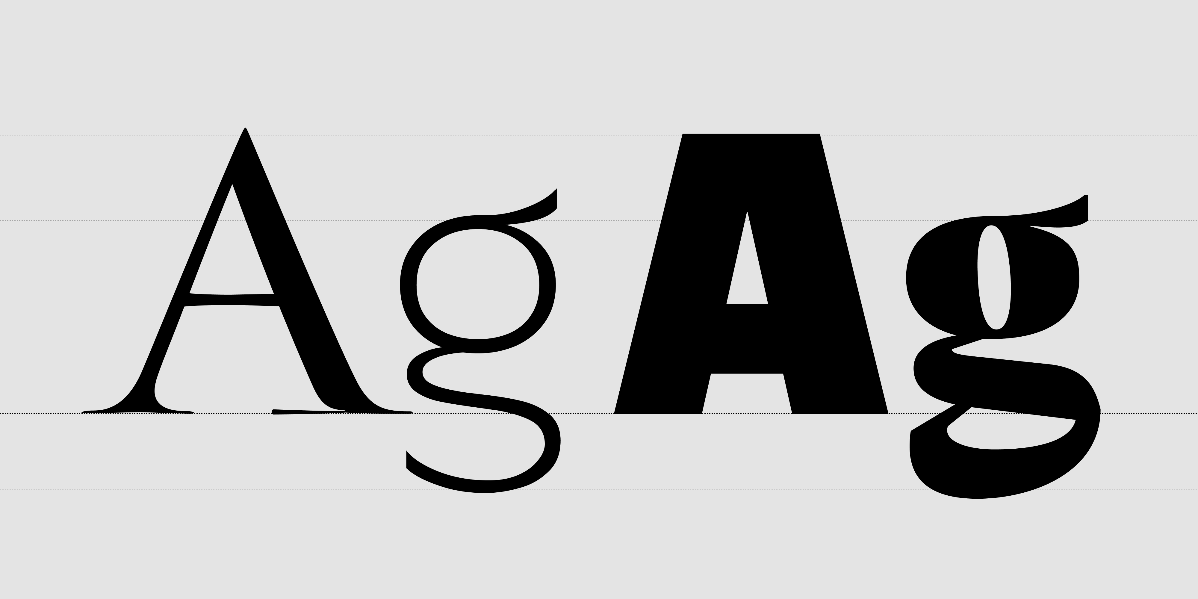
This guide covers six practical font pairing guidelines, each illustrated with real examples from the Resistenza Type catalog.
Why Font Pairing Matters in Branding
Typography is the backbone of visual hierarchy. Thoughtful font pairing helps your audience know where to look first, understand what matters most, and feel the brand's personality — all before they've consciously processed the content.
Whether you're designing a website, packaging, a pitch deck, or a poster, every font combination needs to do three things: complement each other, contrast enough to establish distinct roles, and align emotionally with the brand it represents.
Understanding Font Roles Before You Start Pairing
Before choosing specific fonts, define what each font needs to do in the system:
- Primary: Carries brand identity and leads the visual tone — headlines, logos, callouts. This is where personality lives.
- Secondary: Supports with calm legibility — body text, captions, UI labels. This font should almost disappear into the reading experience.
- Accent: Adds flair or emphasis (use very sparingly) — pull quotes, CTA buttons, subheads. One accent used consistently is a design decision. Two accents used freely is visual noise.
Most well-structured systems use just two fonts. Every additional voice in the room requires a reason to be there.
6 Font Pairing Guidelines That Actually Work
1. Start With Contrast, Not Conflict
Good font pairing starts with contrast — fonts should look different enough to create hierarchy, but not so different that they fight each other. A calligraphic or display font paired with a clean sans-serif is one of the most reliable approaches in type design.
Good font combination:
Turquoise + Performa — A high-contrast calligraphic serif against a neutral grotesque creates immediate visual separation without tension. Two very different voices, both clear about their role.
Font conflict to avoid:
Modern Love + Oddity Script — two expressive scripts competing for the same emotional register. Neither has room to breathe, and neither gets to define the hierarchy.
2. Match the Mood: Font Combinations by Tone
Even when fonts belong to different structural categories, they need to feel emotionally aligned. Pairing a rough, textured display font with a cold precision geometric creates dissonance — even if the contrast is formally correct.
Four font pairing examples by brand tone:
- Luxury / editorial: Nautica Lines + Turquoise Sans — the delicate ruled elegance of Nautica Lines as a display voice, supported by the calligraphic warmth of Turquoise Sans in text roles
- Natural / artisan: Smoothy + Little Boxes — an organic hand-drawn script paired with a playful geometric that shares the same handcrafted spirit
- Playful / expressive: Flipante + Onni — bold display energy balanced by a clean, friendly companion that keeps things readable
- Modern / fashion: Effimera + Auster — a variable humanist sans with a high-contrast serif that brings editorial tension and sophistication
3. Compare X-Height and Proportions
When fonts appear at similar sizes — as in a heading/subheading pair or a label next to body text — mismatched x-heights make the composition feel restless and unresolved. Fonts with comparable proportions tend to sit more comfortably side by side, even across categories.
A practical test: set both fonts at the same point size and check whether the lowercase letters feel like they belong in the same visual space. If one reads as if it arrived from a different design era or tradition, the pairing will require extra work to hold together.
Always preview font combinations in context — in a layout, at actual sizes, with real content. Specimen pages alone are not enough.
4. Use a Superfamily or Designed Type System
Some of the most reliable font pairings come from type families that were built to work together from the start.
- Performa — 108 fonts spanning 6 widths (Compressed to Wide) and 10 weights, with italics. A self-contained typographic system with enough range to handle display, text, and everything between without leaving the family.
- Industria Sans + Industria Serif — a designed pair sharing the same structural DNA, built for editorial and branding work where sans and serif need to coexist without negotiation.
- Squadra + Squadra Stencil — the same geometric skeleton in standard and stencil cuts, ideal for campaigns that need visual coherence across different textures and applications.
Built-in harmony means less second-guessing — contrast and consistency have already been resolved at the design level.
5. One Personality, One Neutral
Let your primary font carry the brand's voice. Let the secondary font stay calm, readable, and structurally invisible. The moment a body font starts competing for attention, readability suffers — and the whole system loses the clarity that makes typography work.
Font pairing example:
Sidera + Ordine — Sidera's distinctive display character sets the tone; Ordine handles supporting text with quiet confidence.
Another approach:
Oddity Script + Annuario — a fluid expressive script for headlines and callouts, paired with Annuario's structured editorial personality in a secondary role. Two fonts from different worlds that share the same sense of craft.
6. Don't Overlook Variable Fonts
Variable fonts change how font pairing works in practice. Instead of choosing a separate font for each role, a single variable family can cover display, text, and UI — shifting weight, width, or optical size to fit the context.
Performa Variable, Effimera, and Auster Variable each offer this kind of range. A variable font paired with a single expressive display face is often a more coherent system than three static fonts used loosely — and it performs better across screen sizes and resolutions.
What Visual Analytics and Eye-Tracking Research Tell Us About Typography
Eye-tracking studies consistently show that weight contrast between headline and body text guides scanning behavior before the reader consciously processes any content. When that contrast collapses — because both fonts are expressive, or because weight differences are too subtle — comprehension slows and hierarchy breaks down.
Research on reading behavior in digital interfaces also shows that consistent typographic systems improve content retention, while inconsistent ones increase cognitive load. The instinct to add character by mixing many fonts usually backfires: users register the chaos before they register the personality.
The most effective font pairing decisions are typically the most restrained — one font that speaks, one font that listens.
Font Pairing in Practice: Real-World Scenarios
These are hypothetical design scenarios to illustrate how RSZ fonts might work in context — not brand partnerships.
Natural cosmetics:
Crispo + Ordine — Crispo's elegant calligraphic script brings a personal, handcrafted feel to packaging and brand headlines; Ordine provides calm, readable structure for ingredient lists, product copy, and labels.
Independent fashion label:
Norman + Tresor — Norman's strong, confident character anchors the brand identity; Tresor adds a refined secondary voice with enough personality to feel intentional, not generic.
Food & hospitality:
Vermouth + Guess What — Vermouth's loose, convivial energy sets the mood for menus and signage; Guess What brings a spontaneous handwritten quality to specials, labels, and chalkboard-style applications.
Creative studio / agency:
Pressato + Totalblack — two high-impact display fonts used with discipline: Pressato's compressed slab presence for headlines, Totalblack's extreme weight for emphasis and graphic moments. A pairing that works when both fonts know exactly when to step back.
Font Pairing FAQ
How many fonts should I use in a design?
Two fonts is almost always enough — one expressive, one neutral. A third font should only appear when there's a clear structural reason for it, such as a monospace font in a code-heavy UI.
Should headline and body fonts be from the same family?
Not necessarily. What matters more is that they share a compatible emotional register and have enough contrast to establish distinct roles. Superfamilies make this easy, but cross-family pairings can work just as well when chosen thoughtfully.
Can two sans-serif fonts be paired together?
Yes, if they're structurally different enough — for example, a compressed geometric display sans with a neutral text sans. The contrast needs to come from weight, width, or optical size rather than serif vs. sans alone.
What's the easiest way to test a font pairing?
Set a headline, a subhead, and a paragraph of body text in both fonts at realistic sizes, in a real layout. If the hierarchy reads clearly at a glance and the two fonts feel like they belong in the same room, the pairing works.
Pair Less, Pair Better
Great font pairing isn't about showing the depth of a type library — it's about structure, emotion, and clarity. Choose one font that embodies your brand's voice. Then choose one that gets out of its way.
Consistency + contrast = strong typography.
Need a ready-to-use font combination or a custom type system designed for your brand? Explore the Resistenza Type catalog, or get in touch for a tailored pairing built around your visual identity.